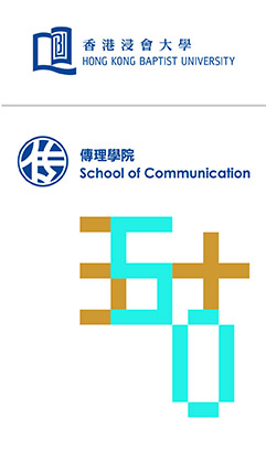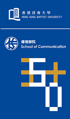
The intertwining of the Chinese characters and numerals of “50” symbolises the School’s dedication to nurture its students not only with the skills and knowledge they need, but also to equip them with global perspectives as future leaders in the communication industry. The “pixelation” of the characters represents the School’s endeavour to be a respected communication School of excellence in creativity and innovation in the world of digital age. The brighter shade of the School’s corporate colour – blue portrays the rich cultural heritage of the School, and dazzling gold symbolises the School’s achievements over the past 50 years.


